

Problem
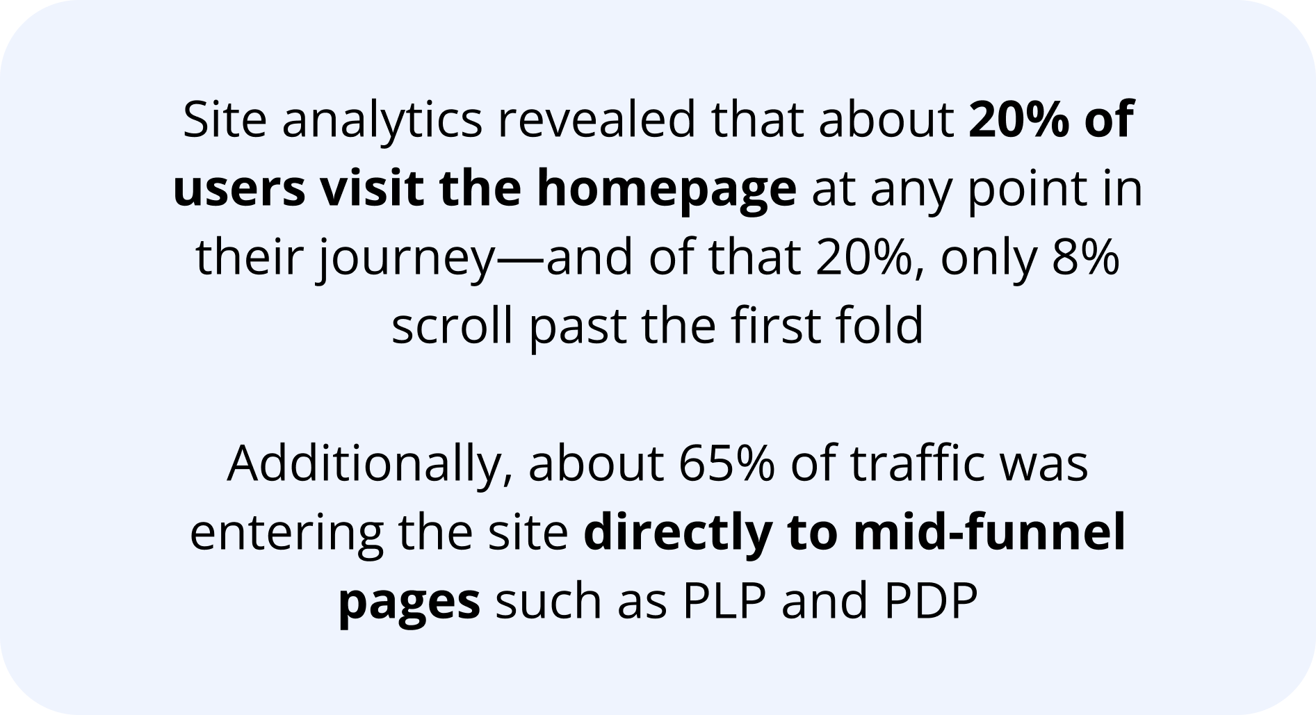
At Academy.com, the most compelling deals and promotions are traditionally showcased on homepage. However, only about 20% of users actually visit homepage, with the majority landing directly on product listing pages (PLPs) and product detail pages (PDPs) via search engines, paid media, and email campaigns. This disconnect significantly reduces the visibility and effectiveness of our promotional strategy, contributing to missed conversion opportunities.
Leading into peak holiday season, we were looking for a scalable solution to help gain more visibility into our best deals and promotions lower in the checkout funnel—especially in key mid-funnel entry points such as PLP and PDP.
Goal
Design a scalable, user-centered solution that surfaces our most valuable deals and promotions across mid-funnel pages. Aim to increase visibility into active offers without disrupting the shopping experience, ultimately driving higher engagement, improving promo utilization, and boosting conversion rates across key site entry points.
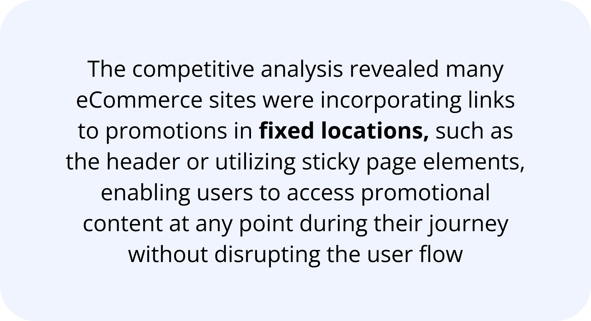
Initial Research
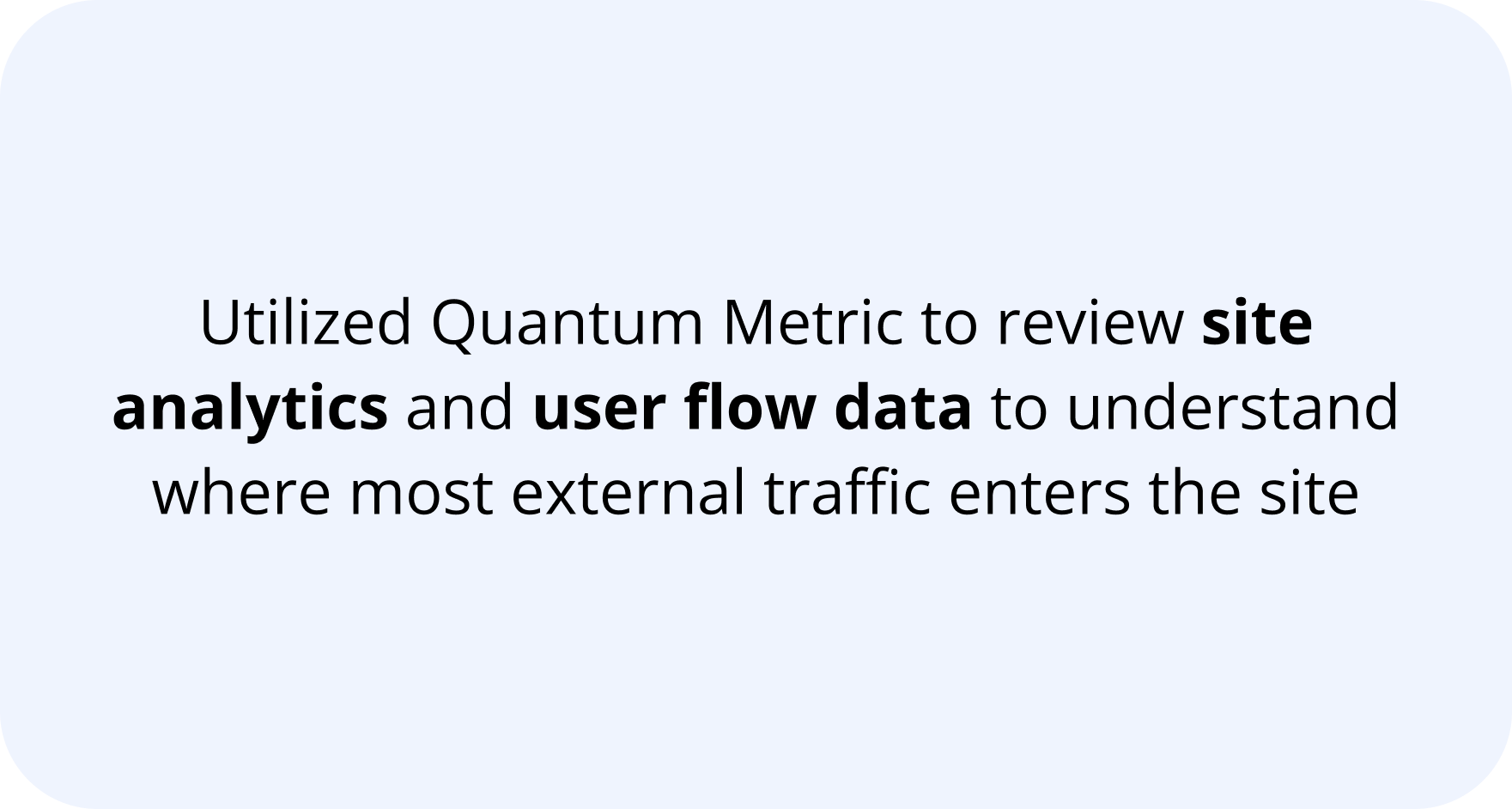
Key Findings
Solution
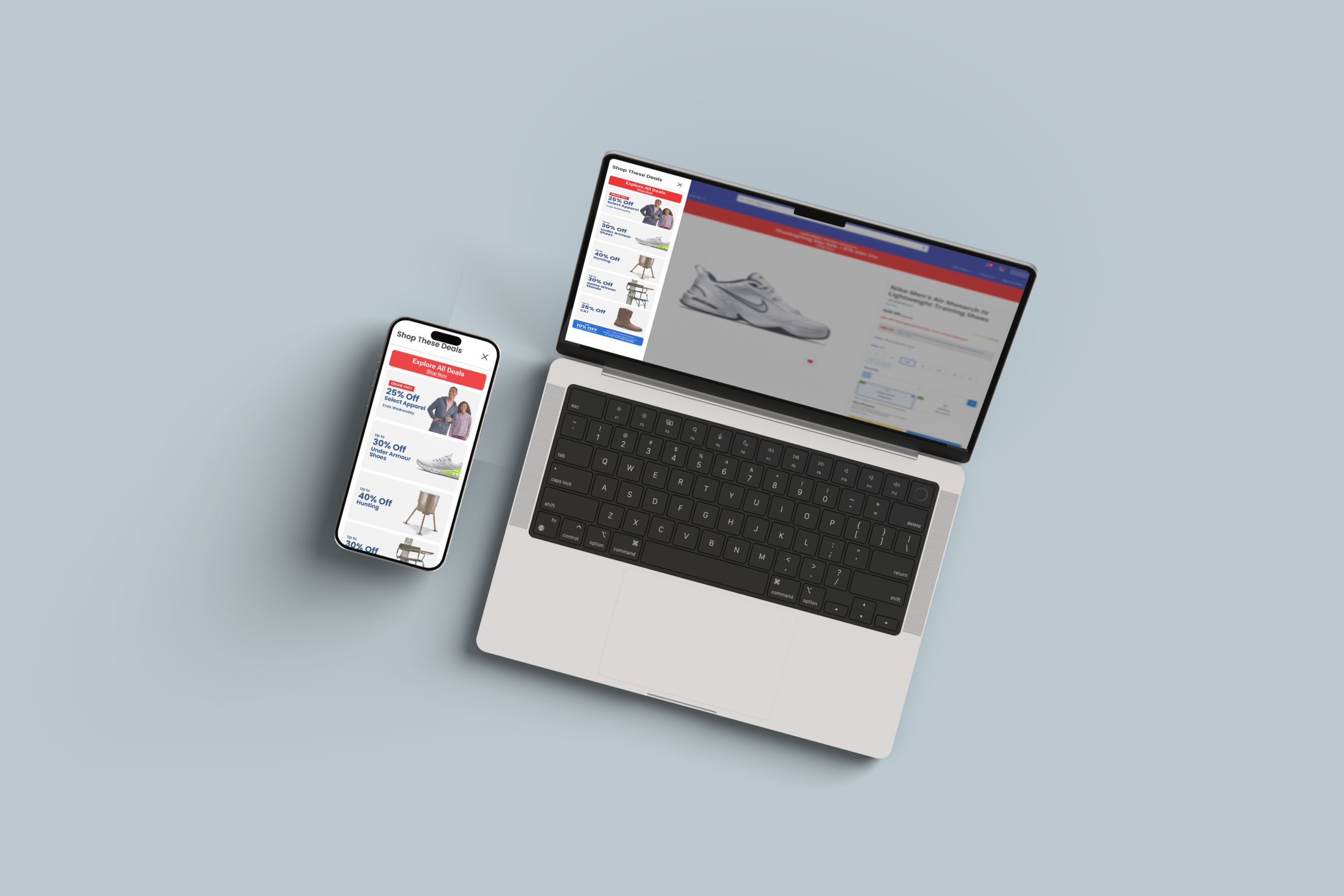
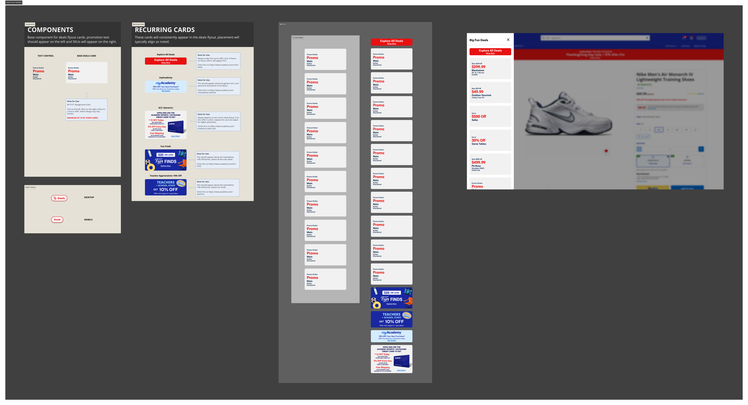
Based on research findings, I proposed designs for a Deals Flyout that persists on both PLP and PDP, aiming to bridge the gap between user entry points and promotional visibility. The design provides the user with constant, non-intrusive access to all active sitewide promotions. Tapping on the “Deals” button opens a flyout, allowing users to view current offers without leaving their current page and disrupting their browsing experience.
A/B Testing
After gaining alignment from stakeholders, we moved to development and A/B testing. I worked with the development team to build out the product feature and QA functionality before going live.
Starting the first week of November, we split traffic 50/50 looking at key metrics such as visits and page views (engagement), conversion rate, bounce rate, and AOV. We ran this 50/50 split for 2 weeks, with 4 different versions to account for changing promotional materials.
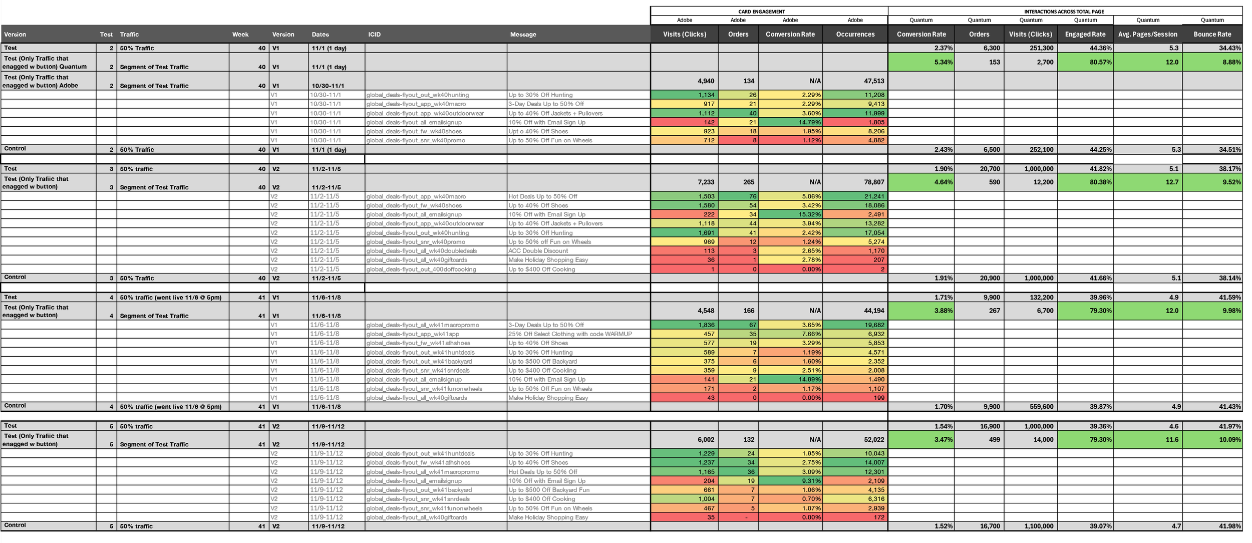
The test results showed that users who engaged with the Deals Button demonstrated significantly stronger performance across key metrics compared to the control. Engaged user’s viewed up to 12.7 pages per session—more than double the control group’s average. Conversion rates increased to 5.34%, compared to 1.5–1.9% in the control. And, bounce rates dropped as low as 8.88%, compared to 34–41% in the control. While AOV fluctuated (Not pictured), the data showed the Deals Button successfully drove deeper site engagement and improved conversion without negatively impacting purchase behavior.
Handoff & Adoption
Following a successful A/B test and full stakeholder approval, I created a master Figma file to hand off to the production teams for weekly use. The simple card based layout allows for quick implementation and minimal effort from the production design team week to week. I also documented clear usage guidelines and established a handoff process between design, development, and project management to ensure smooth and consistent deployment.
The Deals button remains a key part of Academy.com’s mid-funnel experience. To this day, users who engage with the button continue to convert at higher rates, spend more per order, and explore deeper into the site. The feature has proven to be a scalable, low-friction solution for surfacing promotions without disrupting the user journey—demonstrating lasting impact on both user experience and business outcomes.